Quick Summary
The cause
2700-7500K
Every light source has a color of its own. The sensor records it; your eyes silently correct for it.
Best habit
18% Grey Card
One card frame per lighting setup turns white balance from a guess into a single click.
First move
White Balance
Set the neutral point, then exposure. Judging color on a dark frame sends you chasing the wrong fault.
Not the same
Correct, Then Grade
Correction matches reality. Grading sets a mood. A listing image needs the first one.
The proof
R = G = B
On a truly neutral pixel the three channels sit within a couple of points of each other.
Outsourced
From $0.29
Hand-corrected per image, 24-hour standard delivery, 12-hour and 6-hour rush available.
Why Your Product Photos Never Match the Product
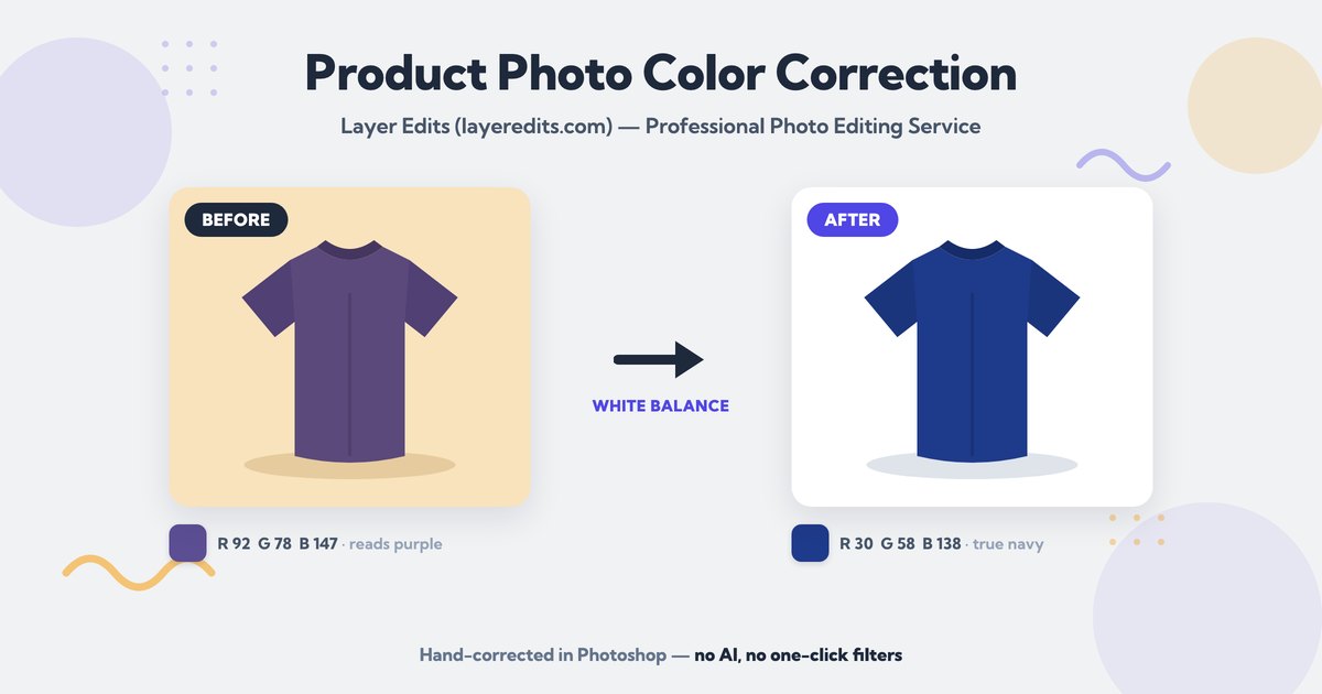
You photographed a navy shirt. The screen shows something closer to purple. Nothing is broken — the light did it.
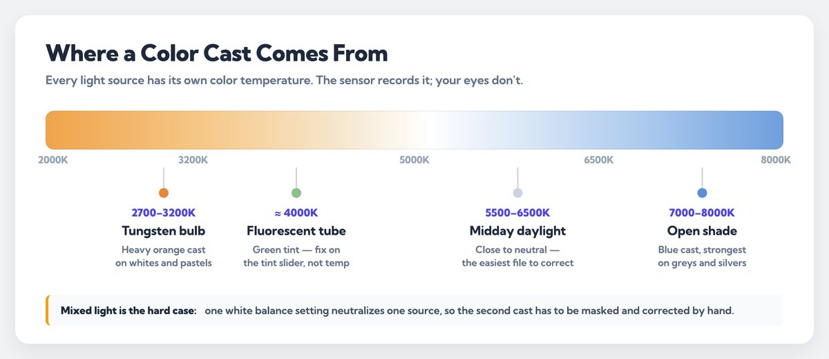
Every light source has a color of its own. A warm bulb throws orange onto the fabric. Window light on a cloudy day throws blue. Your eyes correct for it in the room. The sensor doesn't. It records exactly what hit it, cast and all.
That gap is what product photo color correction fixes. You pull the color cast out, set the neutral point, and bring the color back to what the buyer will unbox. Get it wrong and the returns follow — a customer who ordered navy and unwrapped purple sends it back, and you pay for the shipping twice.
This guide is the photo editing workflow our editors run on catalog images every day, from the reference you set at the shoot to the last check before upload. If you'd rather hand it over, our color correction service starts at $0.29 an image.
Color Correction vs Color Grading: Two Different Jobs
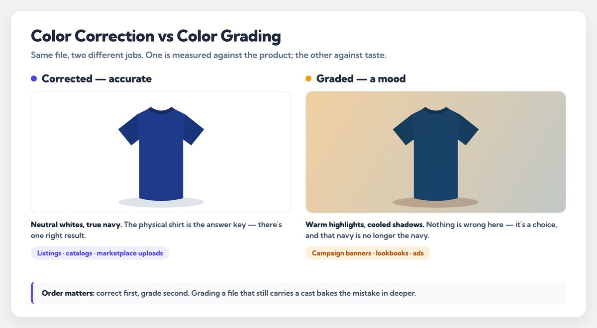
These two get mixed up constantly, and the mix-up costs sellers money. Correction is accuracy. Grading is mood.
Color correction puts the photo back to true. Neutral whites, correct skin, the exact red of your product. There's one right answer, and the product itself is the answer key.
Color grading pushes the photo somewhere on purpose. Warmer, cooler, filmic, moody. It's a creative choice for campaign work, and it's the wrong tool for a listing image.
| Color correction | Color grading | |
|---|---|---|
| Goal | Match reality | Set a mood |
| Judged by | The physical product | Taste and brand |
| Typical moves | White balance, exposure, cast removal | Split tones, curves, film looks |
| Right for | Listings, catalogs, spec sheets | Hero banners, lookbooks, ads |
| Wrong when | You wanted atmosphere | The buyer needs the real color |
Do the correction first, always. Grade on top of a corrected file if the campaign calls for it. Grading a photo that still carries a cast just bakes the mistake in deeper.
Four Things That Throw Product Color Off
Before you touch a slider, know what you're fighting. Almost every bad color in a product shot traces back to one of these four.
1. Mixed light sources. A window on one side, a tungsten lamp on the other, and ceiling fluorescents overhead. Each one lands at a different color temperature, so one white balance setting can't neutralize all three. The fix starts on location: kill everything but one type of light.
2. Auto white balance guessing wrong. The camera looks at the frame and picks a temperature. Fill the frame with a red handbag and it will read that red as a cast, then cool the whole image to "fix" it. Your handbag goes dull.
3. Color bounced off nearby surfaces. Light bounces. A red wall two feet away tints the side of a white sneaker pink, and no white balance slider will undo it, because the cast is only on part of the frame. That one is masking and channel work, not a global slider.
4. The wrong profile on export. You edit in Adobe RGB, export without converting, and the browser reads the file as sRGB. Saturated reds and greens flatten out. The edit was fine — the handoff wasn't.
Common color casts and where they come from
| What you see | Usual source | Where it gets fixed |
|---|---|---|
| Orange or yellow cast | Tungsten bulbs, roughly 2700–3200K | White balance, at capture or in raw |
| Green cast | Older fluorescent tubes | Tint slider, then a channel check |
| Blue cast | Open shade, 7000K and up | White balance in raw |
| Color on one side only | A bounce off a wall, floor or your shirt | Local mask, hand-painted |
| Muddy, grey product | Underexposure, then a lift in post | Reshoot if you can — recovery is limited |
Shoot a Neutral Reference First
The single fastest way to cut editing time is a grey card. It costs less than a lens cap.
Put an 18% grey card in the first frame of every lighting setup. Shoot it, then pull it out and shoot the product. In raw, click the card with the white balance eyedropper. That one click gives you the true neutral for that light, and you sync it across every frame that followed.
A ColorChecker passport does the same job with more patches, so you also get a read on how the light is treating saturated colors. Either one beats guessing. Without a reference, you're matching from memory, and memory is a bad instrument for color.
The Correction Workflow, Step by Step
Here's the order our editors work in. Order matters — each step makes the next one easier to judge.
Step 1: Set white balance from the reference. Eyedropper on the grey card, or on a surface you know is neutral. No card in the frame? Look for something that should be grey — a zip pulley, a shadowed white label, the seam of a shoe box.
Step 2: Fix exposure before you judge any color. Color reads differently at different brightness. Set the exposure and contrast first, or you'll chase a cast that was really a brightness problem.
Step 3: Check the channels, not your eyes. Open the histogram per channel. A color cast usually shows as one channel sitting higher than the others in the highlights. This is where a real cast separates from a memory of one.
Step 4: Remove what's left locally. Bounce casts live on one side of the product. Mask that area and correct only there, then fine-tune hue and saturation on the offending color alone. Global sliders would drag the rest of the frame off.
Step 5: Match the product in your hand. Hold it next to a calibrated screen in neutral room light. This is the step most people skip, and it's the only one that proves the work.
Step 6: Export to sRGB. Convert, don't just assign. Browsers assume sRGB, so anything else arrives shifted.
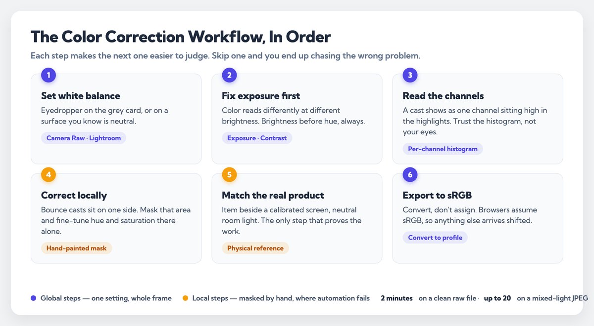
On a clean raw file with a grey card, that runs a couple of minutes an image. On a mixed-light JPEG with a bounce cast, it can take twenty. Hand-editing has no fixed clock, which is why we quote per image rather than per hour on the pricing page.
Keeping Color Consistent Across a Whole Catalog
One good image is a craft problem. Four hundred matching images is a process problem.
Correct one frame from each of your lighting setups properly, then sync those settings to the rest of that setup in Lightroom or Camera Raw. Sync is the start, not the end. Every frame still needs a look, because the product moved, the angle changed, and a shiny surface picks up different light at 30 degrees than it did at 15.
Group your files by setup, not by product. If Monday's shoot ran on window light and Tuesday's ran on strobes, those are two groups even when the product is identical. Then run a contact sheet at the end and scan your thumbnails as a grid. Drift is obvious at thumbnail size and nearly invisible at 100%.
Colorways of the same item need one more pass from you. Grey, charcoal and black in one product line will fight you, because the difference between them survives on a few percent of tone. Correct them side by side in one document, never in separate sessions on separate days.
Colors Off Across a Whole Batch?
Send the batch and a reference. We correct every file by hand, match the colorways against each other, and deliver in 24 hours from $0.29 an image.
Where AI Color Tools Fall Short on Products
One-click color tools have got good at photos of people and places. Products are a harder case, and the reason is structural.
An automatic tool decides what "neutral" means by looking at the pixels. It has no idea what the product actually is. Feed it a beige handbag on a beige backdrop and it will treat the whole frame as a cast, then cool it until the bag turns grey. It can't know that the beige is the product.
Three failures we see over and over in files clients send us after an AI pass:
- Brand colors pulled off-target. A specific corporate red drifts a few points and no longer matches the packaging.
- Bounce casts left in place. Local casts need a mask. Global tools apply one correction to everything.
- Metallics and whites crushed. Silver, chrome and white-on-white lose separation when saturation is pushed globally.
We don't run those tools. Every file at Layer Edits is corrected by hand in Photoshop by one of our 75+ editors, with the product's real color as the target, not an average of the pixels. That's the same reason we hand-draw paths instead of auto-selecting them — there's more on that in what layer editing actually means.
How to Check Color Accuracy Before It Goes Live
Correction isn't done when it looks right. It's done when it survives a check. Five of them, and none takes long.
Calibrate the screen. An uncalibrated monitor is a broken ruler. If you're grading colors on a laptop at factory settings, you're guessing accurately.
Compare against the physical item. Neutral light, item beside the screen, at the same brightness. Nothing else is proof.
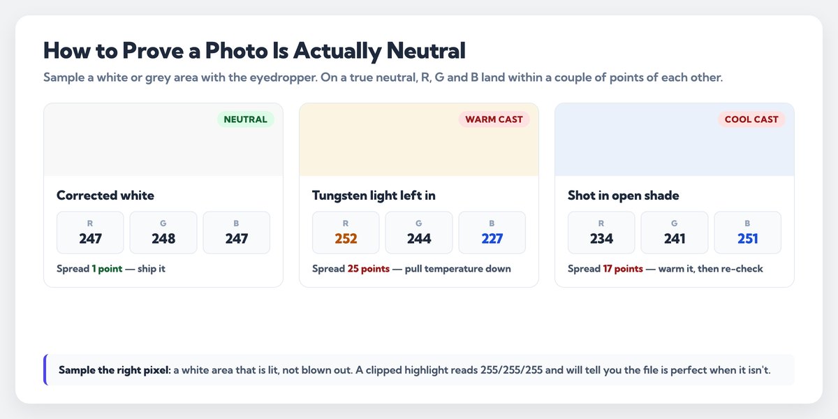
Check the neutrals. Color accuracy is measurable here. Sample a white or grey area with the eyedropper. On a truly neutral pixel the R, G and B values sit within a couple of points of each other. Twenty points apart means the cast is still there.
View it small. Buyers see your image as a thumbnail first. Casts that hide at full size jump out in a grid.
Check it on a phone. Most of your traffic is mobile, and phone screens run warmer and more saturated than a desktop panel.
When It's Worth Handing Over
Correcting ten images yourself is an evening. Correcting four hundred is a fortnight you didn't budget for, and the last hundred never match the first hundred, because your eyes drift over hours.
Outsourcing makes sense when the volume is repetitive, the deadline is fixed, or the colors have to be exact — brand-critical reds, apparel colorways, anything where a return costs more than the edit. We charge from $0.29 an image with 24-hour standard delivery, and 12-hour or 6-hour rush when a launch date won't move.
Send the brand's color values if you have them, a reference photo, or a physical swatch shot in the same light. The more we know about the target, the closer the match. If you want to see the standard before you commit, send two images free — no card, your files, your call afterwards.
Frequently Asked Questions